Mobile-first, mobile-friendly, mobile-optimized, mobile-responsive… the list goes on. You have heard them all, but do you know the differences? Spoiler alert: the number of buzzwords that have been invented to describe web design far exceeds the number of actual design techniques.
But one of these, mobile-first, stands out in a BIG way. If you are considering an incentive and recognition technology purchase for your business, you will want to know why mobile-first should be at the top of your system requirements.
Native App vs. Web App
Rather than boring you with the details around all the terms, let’s start with some general concepts. Most importantly there are two basic ways to design software on a mobile device: as a native app, or as a web site (also known as a web app). Native apps are self-contained programs that live on the user’s device. They are developed separately for different mobile operating systems (e.g. iOS and Android) and must be installed from a centralized app store or marketplace onto each device you want to use them on. Whenever a new version of the software is released, users need to download the update. A web app runs entirely in the device’s web browser instead of existing as a separate application—so, the operating system doesn’t matter.
Responsive Design
Zooming-in to the world of mobile web sites, there are several more design approaches. Sometimes a company will design completely separate sites, each one formatted and optimized specifically for phones, tablets, and desktop browsers. Alternatively, a technique called responsive design is a way of building a single site so the layout rearranges to fit the size of the screen being used to view it. This is advantageous because the same version works in everyone’s browser. The design fits on small phone screens all the way up to large desktop monitors. But it’s not just about phones, it adapts to whatever size you make the browser window. If you need to look at two sites side-by-side on the same screen, responsive design will ensure that nothing gets cut off because the window is too narrow.
Ok, we’ve made it to the big one: mobile-first responsive design. Don’t run away now. This is what you want. Most importantly, mobile-first is about delivering the best user experience wherever you are. Let’s go a little deeper:
1) Mobile-first is a specialized approach to Responsive design.
Traditional responsive design rearranges all content of a desktop site onto tablet and phone screens. This makes desktop sites accessible on mobile devices, but it might not consider the importance or usefulness of all of that content. The mobile user experience is not the primary focus.
From a mobile-first perspective, there are often features and content that exist in the desktop version of a site that is unnecessary or impractical on a phone. Mobile-first design starts by including only what makes sense to put on a phone. But remember, mobile-first is still responsive design, so it adapts to various screen and browser sizes. After the mobile design is set, you determine what features and content become relevant on larger screens — from the phone, to tablet, to a laptop, to desktop.
2) Mobile-first is optimal for Incentive and Recognition participants.
The reality is your workforce is doing everything on their phones – especially busy salespeople who are on-the-go.
When people access a site on their mobile devices, they tend to interact for shorter periods of time, they are faced with more distractions, and they don’t have access to all of the business resources and information they would have at their desk. Complex forms and sales reports, for example, could be reformatted to fit on small screens, but they don’t belong there. When something is designed mobile-first, such features are left out of the mobile site so the user experience can remain hyper-focused on on-the-go tasks.
A premium user experience has become an expectation in today’s digital landscape; so, choosing a product that delivers great UX to your workforce on their mobile devices is mandatory, not a nice-to-have.
Lastly, smooth, efficient interactions are key to keeping participants engaged with the program. Mobile-first design takes this into account.
PerformX, One10’s Incentive and Recognition Technology
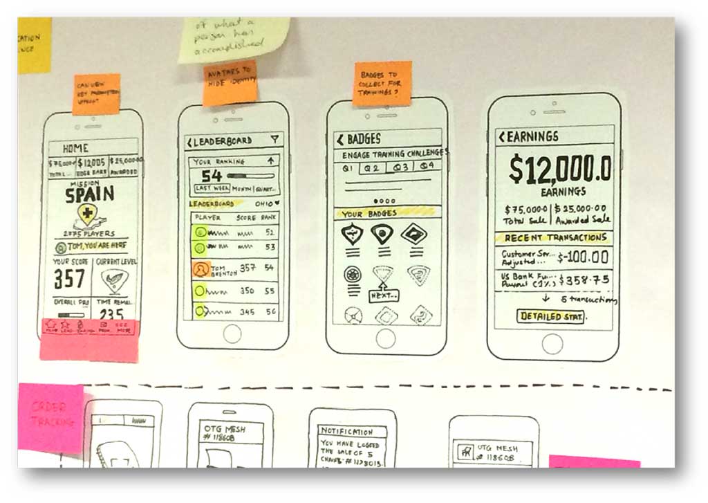
We conducted user research to identify the top needs and wants of our participants. Convenient mobile access to actionable information was at the top of their Wishlist. That’s why we chose to take a mobile-first approach to the design of PerformX. It’s not focused on how much the system can do, instead, it is about what people do with the system. We designed the optimal experience for the content and features that are useful when you’re not at your desk.
As soon as the home screen loads on their phone, PerformX meets the 5 key goals of our participants – all within a single tap or swipe. The design delivers both rich informational content, and at-a-glance performance feedback — so it’s useful whether you have 10 minutes or just 60 seconds.
And since it’s a web app, people never need to download an update like with traditional mobile apps. PerformX always delivers the best user experience to the right device, seamlessly — from the phone, to tablet, to a laptop, to desktop. Contact us today to learn more.

Sean Bradley
Sean Bradley is the Vice President of Product and leads the product management, user experience, and engineering organizations at One10. With over 15 years of experience in startups to Fortune 100 product organizations, Sean helps the world’s largest companies achieve their desired goals through a data driven approach. Everyday Sean’s teams are working to understand and solve unique problems in the sales and employee performance industry through our innovative product platform. Contact Sean today to talk more about how our solutions can solve your employee incentive and recognition goals with One10!


